
Leon Heng
UX/UI Designer
Discovering
Bravely
Redesigning a new onboarding experience for a mental health app


Design Brief
Bravely is a mental health company, focused on using tech to bridge the critical gap in mental health support around the world. Bravely's mobile app gives users smarter tools, to help them better understand their mental health - with evidence based, therapy proven approaches and content for growth minded people, curated and presented for every unique individual.
Bravely's mobile app was in urgent need of an overhaul in their onboarding experience. The aim of the project is to create a new onboarding flow that provides users the freedom to appreciate and learn the app on their own pace and terms.
Duration
3 weeks
Team Project
Role
UX/UI Designer
Skills
User Research
Prototyping
Usability Testing
Iteration & Refinement
Tools
Figma
Adobe Illustrator
Miro
Discover
Define
Develop
Deliver
User
Research
User Persona
Customer
Journey
Map
Key Areas of
Improvement
Brainstorm
Workshop
New
User Flow
Prototype
Round 1
Prototype
Round 2
Client Review
Initial Research and Insights
During the development of the mobile app, the onboarding portion was quickly put together for their beta test launch. From our initial research, these are what we discovered:
-
Current onboarding doesn't match the updated app style
-
The process isn't very innovative
-
Users feel that it is not a great introduction to the app and they still don't understand what is going on after trying it out.
Customer Journey Map
After the initial research, a customer journey map was created to understand what the users go through and identify the key areas of improvement and opportunities for the onboarding flow.

How might we:
Problems:
Areas of Concern:
1. Introduce the features of the app?
-
What's the purpose of the app and its features?
-
What is "toolkit" and "climate"?
-
Climate Kit
-
Toolkit
-
Calmfeed
-
Library
2. Guide users through the user flow?
-
Unclear of what to do next
-
What other features are there?
-
What's there to see and do?
-
Personalization
-
Browsing content & cards
-
Prioritization of features
3. Explain individual functions?
-
What content is available and how to find them?
-
What does each function do, and how does it work?
-
Like/Dislike
-
Content Categories
-
Saving to library
-
Reminders
Design Direction
Compared to other competing mental wellbeing apps, most of them have a guided tutorial through their various features to quickly onboard their users. Our first solution was to create a fully guided tour to get the users up to speed on what is being offered by the app, which we discovered that they experienced fatigue midway and wanting to leave the tour or abandon the app. Upon careful adjustments, we looked into achieving the ideal balance of allowing users to have enough freedom to explore, yet not leaving them lost like the existing onboarding.
User Flow - Prototype V1

User Flow - Prototype V2

Solutions
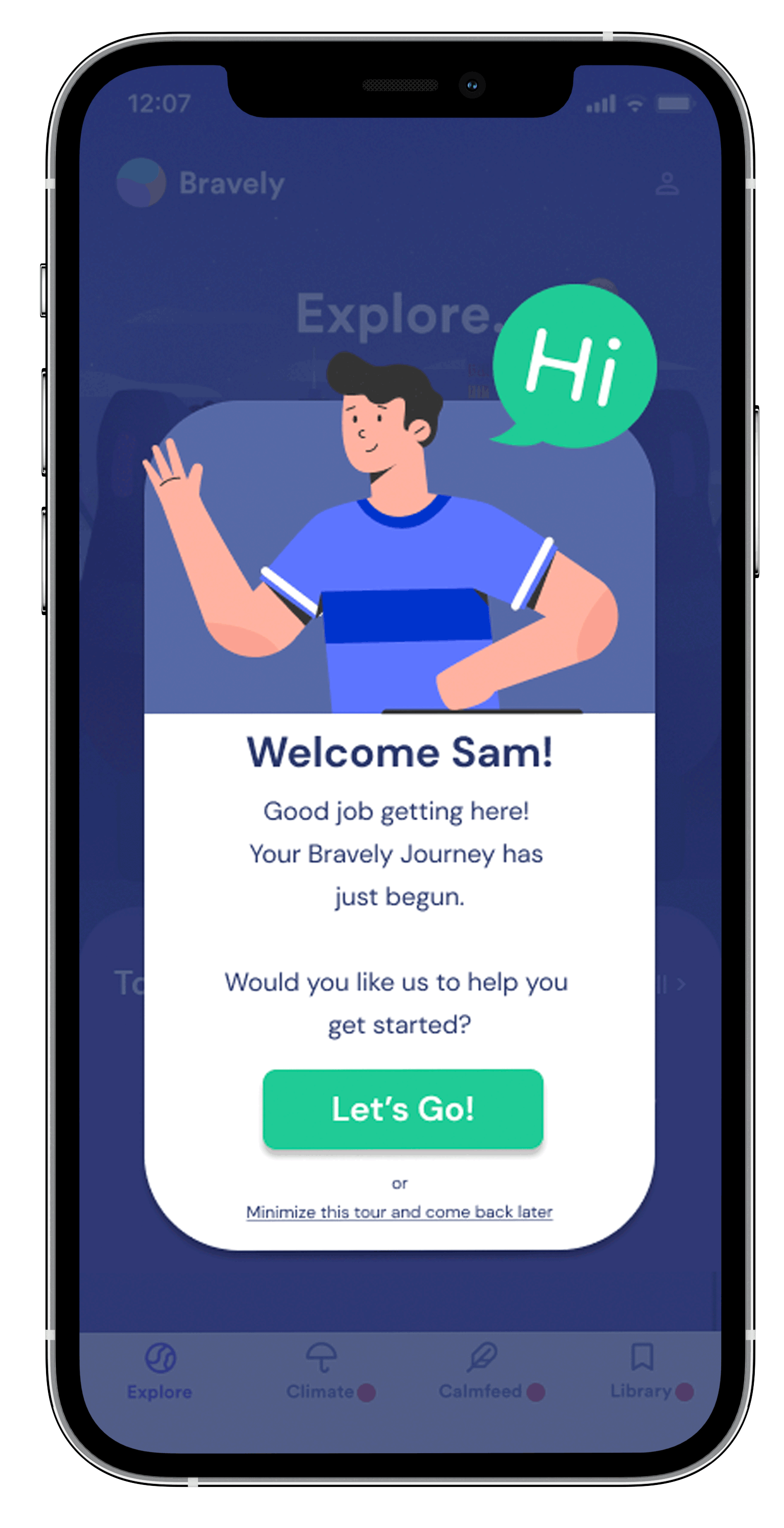
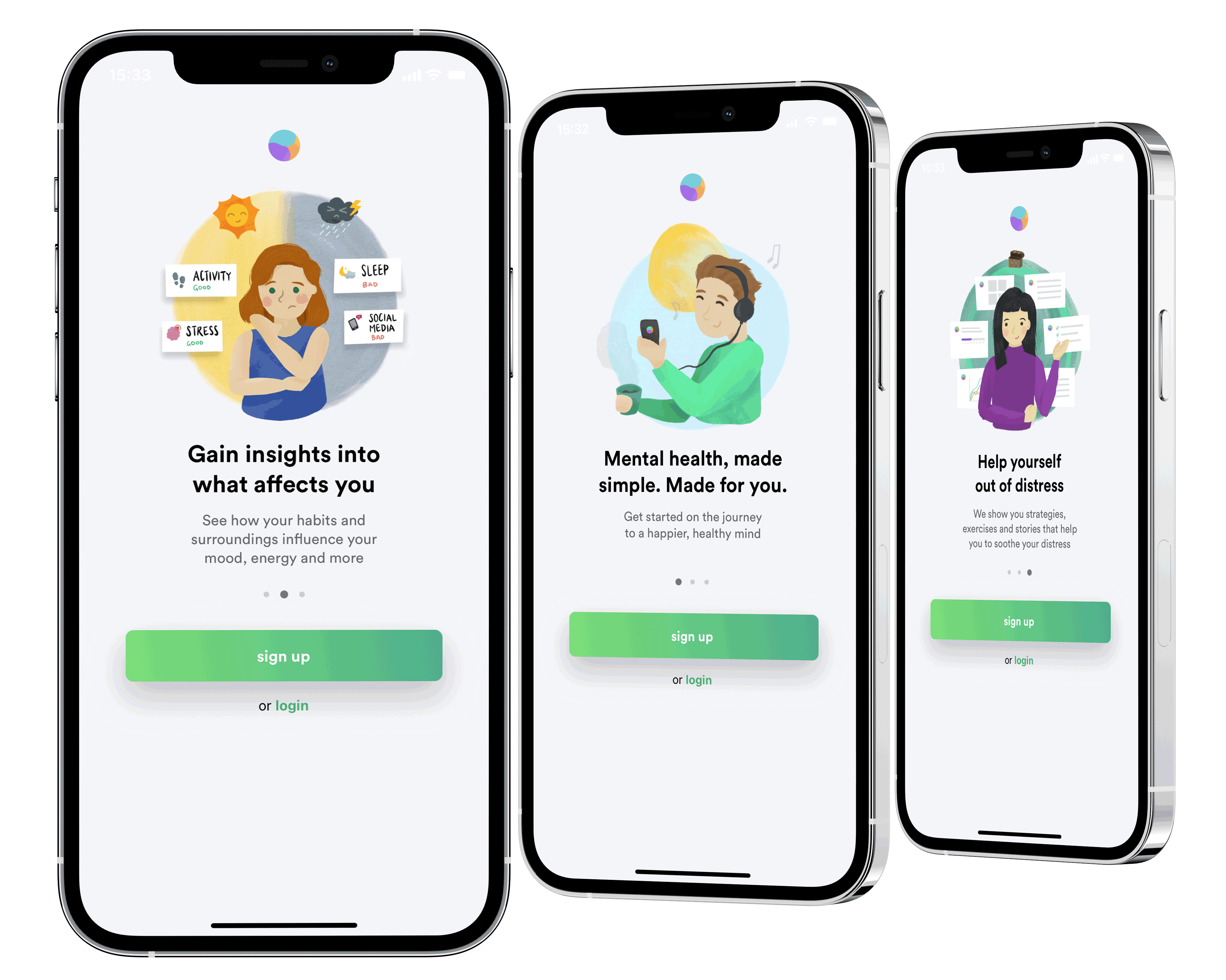
Signing Up Process
The sign up process up till the initial landing, which is also the start of the users' initial app experience, is kept concise and short, to prevent information overload and letting them access the app faster.


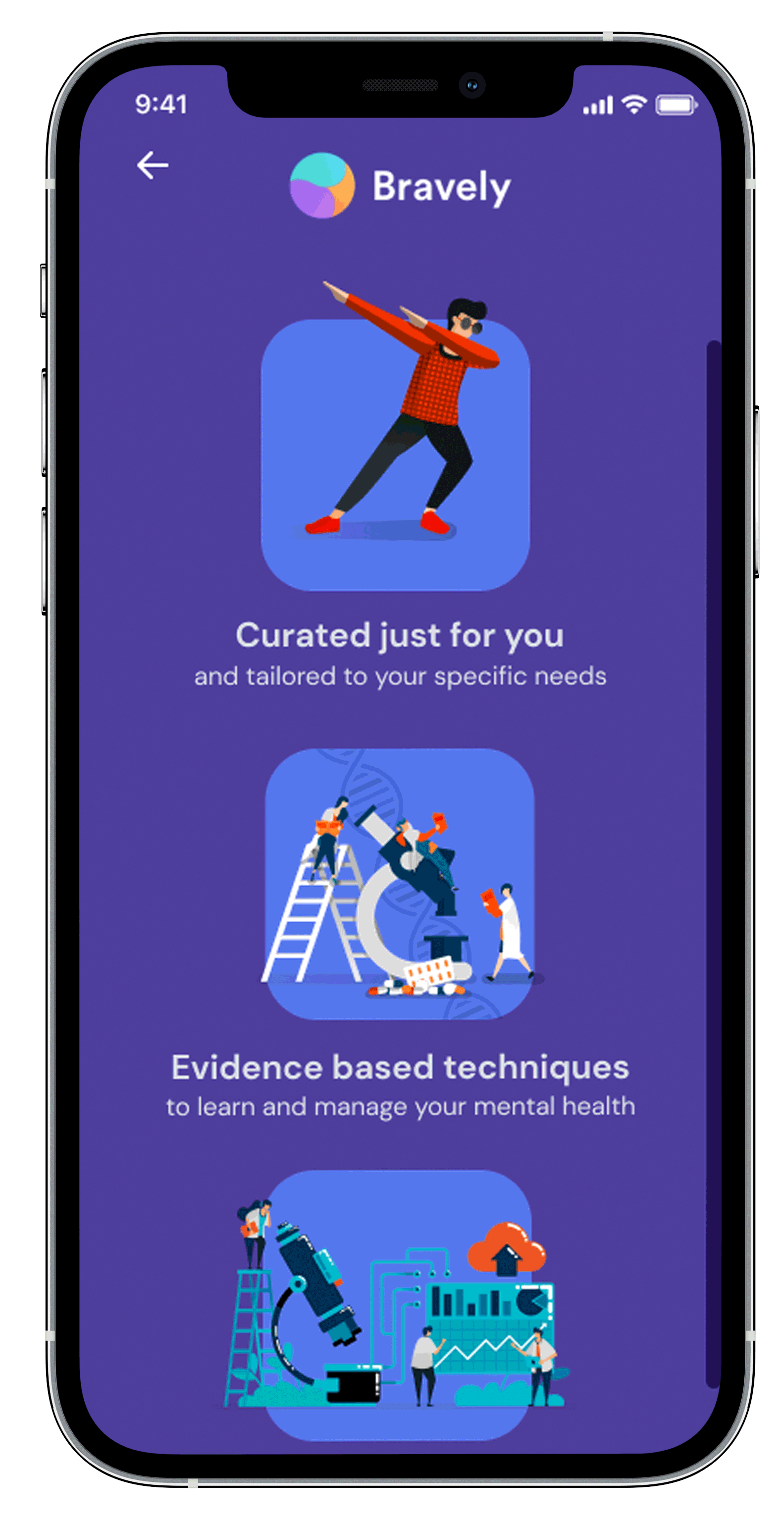
Toolkits
To improve on the toolkits introduction, the design direction was to allow the users to freely explore the functions, yet be able to learn about them without forcing them into the next part before they can digest the information provided to them. Strategically placed tooltips, and short concise introductions are provided to the users so that they can decide to only move on when they are comfortable.


Climate Kit
The climate kit is the focal point of the app. One issue was how to get the users to understand the term "Climate", which we used various weather icons and images to draw parallel. Another problem, was to get them to complete the daily check-in as well as understand that the results are progressively tracked. Usage of glowing buttons and tooltips help guide the users through the check-in process.


Calm Feed & Library
The calm feed, as well as the Library feature, were originally intuitive enough and was found to be very easy to understand. In order to match the current app style, a short description was added into the starting page instead of having a popup to disrupt the user's flow.


Client Review

Rackley Nolan, Co-Founder & COO of Bravely
We have been thoroughly impressed by the work completed by this group of students. From the initial contact to the end of the project, the team was attentive and professional, I would have no hesitation in working with them again. Throughout the project we have been very impressed by the quality of work, even the draft versions. The final deliverables have exceeded our expectations, in the depth and extent of the information presented. The onboarding flow they have created fits the brief, and is scalable for future development or changes to our product.
Reflections
It has been a very interesting experience working as a team, on a project that has so much meaning, especially for my first UI/UX project working for an actual client. This project hits home on many areas, all the more so when we are living in difficult times due to the COVID-19 pandemic, which makes the issue of managing one's mental wellbeing even more important.
Through this project of designing a new onboarding experience for Bravely, I discovered something interesting: A good, intuitive & efficient onboarding experience that is able to strike a balance between guidance & freedom to explore, is very important as it can decide whether a user will continue to use the product, or just choose to abandon it from the beginning. It would be very interesting to explore how much of this initial interaction would affect user retention rates.